%402x.svg)

In this case study, I share how we built a flexible and cohesive design system for Leagueworks, a sports management app I'm developing with my co-founder Noah Mah. Leveraging my prior experience with building scalable systems at orxtravel.com, metrists.com and bnwtravel.com, we focused on creating a robust foundation that would grow with our brand while maintaining consistency. This journey covers the strategies, tools, and methodologies that allowed us to build a scalable design system capable of delivering a seamless user experience across all platforms.
"A design system isn’t a project. It’s a product serving products."
– Nathan Curtis, EightShapes
Introduction
At Leagueworks, our mission is to streamline sports league management by offering an all-in-one platform for scheduling, team management, and statistics tracking. As a small team aiming to make a significant impact, we recognized the importance of developing a design system capable of scaling with our growing brand while ensuring a consistent and seamless user experience.
My Experience Building Design Systems
Throughout my career, I have had the opportunity to build design systems for both startups and white-label enterprise applications. I've built design systems for both startups and large enterprises, gaining a clear understanding of how to balance flexibility with consistency—crucial qualities for any effective design system.
At ORX Travel, a white-label travel platform used by companies like BNW Travel and Avenue Two Travel, I developed a scalable branding platform using Material UI (MUI). This system needed to cater to the unique branding requirements of multiple clients while maintaining a shared codebase. Creating a flexible theming solution was essential to allow each client to have distinct visual elements without interfering with others.
As a co-founder of Metrists, an open-source booking publishing tool built on Shadcn/UI, I focused on developing a design system that worked for a diverse, global audience. Our goal was to create an intuitive and accessible design language that could be easily customized, ensuring components were straightforward and adaptable even for new users. We prioritized inclusivity and usability to meet the varied needs of our user base.
These experiences shaped my approach at Leagueworks helping me build a robust, scalable foundation that supports brand growth without compromising consistency.
Understanding the Challenge
When we began designing Leagueworks, we understood that our design system needed to be flexible, scalable, and consistent. It had to adapt to new features and evolving requirements, support our brand as it expanded, and provide a uniform user experience across all platforms. However, we encountered several initial challenges.
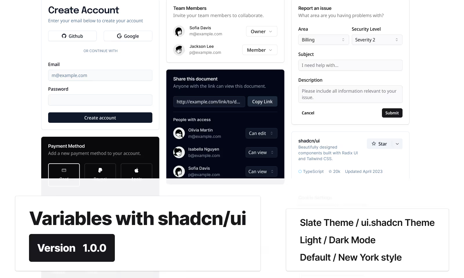
The existing Shadcn/UI components in Figma were static and did not adapt well to different screen sizes, leading to inconsistent design elements. Styles were hard-coded, making it difficult to maintain uniformity across components. Developers faced increased development time due to the need for extensive manual adjustments, which slowed our workflow.
For our small team of three, efficiency was crucial. We needed a solution that would streamline our processes and ensure a high-quality end product without overextending our resources.
Atomic Design
To address these challenges, we adopted the Atomic Design methodology developed by Brad Frost. This approach breaks down user interfaces into smaller, reusable components, allowing for a structured design system that is both scalable and manageable.
In Atomic Design, we start with atoms—the fundamental elements like buttons, input fields, and labels. These atoms combine to form molecules, such as a search form that includes an input field and a submit button. Molecules come together to create organisms, which are more complex components like a navigation bar composed of menus, logos, and search forms. Templates are then created to define page-level structures, placing components into a cohesive layout. Finally, pages are specific instances of these templates, populated with real content.
By focusing on these smaller components, we ensured consistency and reusability throughout the application. This modular approach allowed us to build a design system that could easily scale and adapt to new requirements without compromising on quality or consistency.

Implementing Design Tokens
Design tokens are standardized variables that store design attributes like colours, typography, and spacing. Serving as a single source of truth for our design elements, they ensure consistency throughout the system.
Identifying Gaps
Our initial step was to evaluate the existing Shadcn/UI components in Figma. We identified several issues:
- Inconsistent Use of Styles: Colors and typography were hard-coded using hex values and fixed font sizes, making global updates cumbersome.
- Lack of Responsiveness: Components did not adapt to various screen sizes, leading to a fragmented user experience.
- Static Components: Elements were grouped in ways that did not reflect their behaviour in code, limiting flexibility.
For instance, a button component might have been fixed at a specific width, causing it to appear misaligned on mobile devices.
Building the Core Tokens
To resolve these issues, we established core design tokens for colours, typography, and spacing. By defining semantic tokens such as --color-primary, --font-heading, and --spacing-md, we created a standardized foundation for all design elements.
For colours, we set tokens like:
--color-primary: #1A73E8;
--color-secondary: #FF7043;
--color-background: #FFFFFF;
In typography, tokens like --font-heading and --font-body standardized font styles:
--font-heading: 'Inter Bold', sans-serif;
--font-body: 'Inter Regular', sans-serif;
--font-small: 12px;
For spacing, we defined tokens to ensure consistent layouts:
--spacing-xs: 4px;--spacing-sm: 8px;
--spacing-md: 16px;
--spacing-lg: 24px;
--spacing-xl: 32px;
By embedding these tokens into every component, any change to a token would automatically update all related elements. Modifying --color-primary, for example, would alter the colour of buttons, links, and other elements that utilize this token, ensuring consistency throughout the application.
.png)
Transforming Design Resources
With our design tokens established, we transformed the static Shadcn/UI components into dynamic, responsive elements:
- Utilizing Figma Tokens: We applied the design tokens within Figma using the Figma Tokens plugin. This allowed us to link component styles directly to our tokens, enabling real-time updates.
- Implementing Auto Layout: We rebuilt components using Figma's auto layout feature, making them responsive. Components now adjust automatically to different screen sizes, reducing manual adjustments and ensuring consistency.
- Collaborating with Developers: We worked closely with our development team to map these design tokens to CSS variables in Tailwind CSS, a utility-first CSS framework. This ensured that designs in Figma translated accurately into code.
Responsive Components in Action
Initially, our components were rigid and did not adapt to different screen sizes. By leveraging Figma's auto layout feature, we made our components responsive:
- Flexibility Across Devices: Components adjust seamlessly across mobile, tablet, and desktop devices.
- Reduced Design Time: Designers spend less time creating multiple versions of the same component.
- Consistency: Ensures a uniform user experience regardless of the device used.

Achieving Efficiency and Scalability
Transforming our design resources led to significant benefits. The use of design tokens replaced ad hoc styles, creating a consistent appearance across the application and our marketing site. Developers could implement styles directly from the design specifications, reducing development time and minimizing errors. This alignment between design and development fostered a more efficient and cohesive workflow.
Our design system is now scalable, readily accommodating new features and updates without sacrificing consistency. As Leagueworks grows, the design system can evolve alongside it, providing a solid foundation that supports expansion and innovation.
Metrics and Outcomes
We observed a 30% reduction in development time, as developers had clear guidelines and reusable components. This efficiency allowed our team to focus more on enhancing functionality and user experience rather than resolving design inconsistencies.
The shared design language improved collaboration between designers and developers, streamlining communication and reducing misunderstandings. This synergy contributed to a more productive team environment and a higher-quality end product.
Conclusion
Investing time in rebuilding our components with auto layout and implementing design tokens has established a solid foundation for Leagueworks' growth. Although the process was time-consuming, the long-term benefits are substantial:
- Efficiency: Streamlined workflows and reduced redundancy save time for both designers and developers.
- Consistency: A unified design language ensures a seamless user experience across all platforms.
- Scalability: Our design system can readily accommodate new features and branding updates as Leagueworks expands.
Sharing Our Work with the Community
We recognize that not everyone has the time or resources to build comprehensive design systems from scratch. Therefore, we are committed to giving back to the design community. We have made our modernized design system publicly available on the Figma Community, allowing other designers and developers to benefit from our efforts.
By sharing these resources, we aim to foster collaboration and innovation within our industry. We are excited to contribute to a more robust and creative design community and are eager to assist others in achieving their goals.
Thank you for reading. Please feel free to reach out if you have any questions or thoughts.


